Thursday, 25 March 2010
Q4 Who would be the audience for your media product?
A Rahs favourite shop would usually Jack Wills or Abercrombie and Fitch, where money is no object and for a break they will proberbly stop off at Starbucks Coffe. They mainly listen to mainstream music, such as Indie and R & B, with artists such as the Kooks and Beyonce. When it comes to the media a Rahs favourite shows would be Hollyoaks, Lost, Desperate House Wifes, Gossip Girl and Goks Fashion Fix. Favourite magazine would have to be vogue for a girl and a favourite newspaper would be the Independant or a similar middle class paper.
Q6 What have you learnt about technologies from the process of constructing this product?

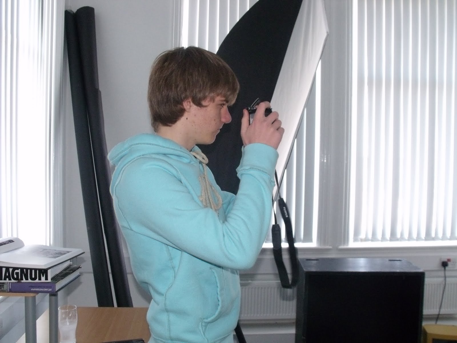
During the proccess of making my magazine I had to do a photoshoot for the pictures in my magazine. I used a camera to take the photos, there were lots of different modes and view types on the camera which I had to learn to use. Above is two pictures of me using a camera.

I used lots of different programs on the computer to put my magazine together. Above is a picture of me using Adobe In-design, which I learnt to use by watching a tutorial video. I learnt how to make columns the exact same size and placement and equally distribute text between them. This gave my magazine a more proffessional and neat look.

This is a picture of me using Photoshop, in which my skills on this software developed throughout the proccess of making my prelim and final product.


Wednesday, 24 March 2010
Photoshoot

Strengths:
- The scruffy overgrown location could represent the style of the band, as people that fit the indie brand, usually look scruffy. For example the long, curly out of control hair many male indie members have.
- All the models have been comfortably fitted into the photo.
- The models look relaxed representing the style of my target audience.
- Nice space in the top left corner to have a slanted title
Weaknesses:
- All the models are touching their own hands. Their body language as a result shows that the are not confident and comfortable with eachother.
- Also the members an either side are not looking at anything to do with the photo, making the reader think there is something more interesting that isn't on the photo.
- The models could be further up in the image, so that the image looks filled and interesting.
- The angle for the photo is flat, however, I could have taken the photo from a low angle to give the band a sense of power and masculinity
 Strengths:
- The photo represents the style of the target audience, as it is very relaxed and the band looks as if they are just 'chilling out.'
- Can clearly see the facial expressions of the models.
- The scruffy overgrown location could represent the style of the band, as people that fit the indie brand, usually look scruffy. For example the long, curly out of control hair many male indie members have.
Weaknesses:
- One of the band members has almost completely been cut out of the picture.
- The band members are too low in the shot, as a result their eye lines are not a third of the way down the page, meaning it is difficult for the reader to relate to and like the models.
- It would be better if we could see more of the band members, rather that just the top half of their bodies, so the reader can see that the band is sat down.
- The facial expression of the model on the right doesn't really represent anything to do with my target audience of my band.

Strengths:
- Two models on the left have very relaxed but still happy expressions. This could represent the music they play.
- Plenty of room for titles and text, if I were to use this photo as my double page spread.
- Only the three smarter members of the band, also the three with long hair. This makes them look similar and together.
- Electrical works have given a natural border as somewhere a title could go.
Weaknesses:
- Models are too low in the picture.
- Eye lines are not a third of the way down the page so the reader cannot relate to the members of the band.
- There is a door to the far right of the picture, this would have to be cropped out of the photo, as it does not fit in with the photo.

Strengths:
- Height levels show increasing masculinity right to left.
- Models fill the page well, so there isn't much dead space.
- Models eye line a third of the way down the page, enabling the reader to relate and like the model.
- Model in the middle is looks natural and comfortable leaning in towards male member of band, representing the maturity and openness of sexuality of my young target audience.
- Pose of the female model shows her confidence and femininity.
- The colour of the bricks could be used to represent the models attitude to music. The model on the left has darker bricks behind him representing heavy music and the two models on the left have brighter bricks, which could represent happier lighter music. This could be supported by the ways the models are dressed.
Weaknesses:
- Model on the left has his eyes closed.
- Photo is at a slight angle. As a result the lines made by the bricks in the background slant downwards as the reader follows the page along. Also if there is text on this image, it may be difficult to read if these lines of the bricks are not parallel with the text.
- There is a door on the very far right of the photo. This doesn't match the rest of the photo and will have to be cropped out if this photo is to be used.
Strengths:
- Very typical location of an indie band photo.
- Poses are relaxed and uninterested, representing the style of my target audience.
- Facial expressions are uninterested and serious, hinting at the attitude of the target audience.
- Space above the models for a title or text.
- Eye levels of the taller members of the band are a third of the way down from the top of the image. This makes it easier for the reader to relate to them.
 Strengths:
 - Very typical location of an indie band photo.
- Poses are relaxed and uninterested, representing the style of my target audience.
- Facial expressions are uninterested and serious, hinting at the attitude of the taret audience.
- Space above the models for a title or text.
- Eye levels of the taller members of the band is a third of the way down from the top of the image. This makes it easier for the reader to relate to them.
Weaknesses:
- Model on far right has his eyes closed.
- Blank space on the right of the image, but not on the left of the image.
- Slouched model may be to low in the shot, making the shot look unbalenced
 Strengths:
- Each member of the band is shown to be equally masculine. This is because the person at the front of the picture is in the foreground of the image; however, she is the lowest out of everybody in the image. As you work your way back through the picture the people go further back in the depth of the shot which lowers their masculinity. However, they also get taller and further to the left of the image, which boosts up their masculinity.
- The facial expressions are happy and represent the upbeat exciting music the band plays.
- None of the models faces are obscured.
- The models are all dressed in clothing that represents my audience.
Weaknesses:
- The facial expressions don't really represent my target audience very well as they are too happy, whereas it would be better to have them looking serious to represent the attitude of my audience.
- The angle of the shot should be more to the left, so that more of the wall is in the shot. As the location isn't very clear and it is difficult to make out what type of location it is.
- The model at the back of the image has his eyes closed.
- Eye line is not a third of the way down the page, making it difficult for the reader to relate to the models.

Strengths:
- The lighting on the female model makes her look more pale than usual. This can represent purity and innocence.
- Photo looks natural and relaxed.
Weaknesses:
- Model second from last is looking away and laughing at something not connected to the photo shoot.
- None of the models eye lines are a third of the way down from the top. Making it difficult for the reader to relate to the models.
- Not enough of the wall is in the photo, which is meant to be the basis of the location.


Strengths:
- The model in the foreground strong masculinity, due to his height and the fact he is in the foreground.
- Good space to have text on the left side of the page.
- Also the serious face of the front man gives the band attitude and presence.
- Location is typical representative of an indie band, in a back alley with quite a worn and derelict look.
Weaknesses:
- Face of the female model is obscured by the front man.
- Eye lines are not a third of the way down from the top. This makes it hard for the reader to relate to them as it does not feel as if they are on the same level.
- I should have had the entire band making a serious expression on their face to match the front man and enhance the bands attitude even more.
Thursday, 18 March 2010
Action Plan

Monday, 8 February 2010
Photoshoot Planning
 Rationale:
I have placed the subject(s) in front of a white screen, which will be the colour of my background in my magazine. I will use two high key lights on each side of the subject(s). This is so there are no shadows and ensuring that I get the most professional looking image I can. The camera will move around so that I get a variation of angles and positions.

There will be 4 subjects in this photo, as this photo will be on my double page spread as my band. It will be taken in front of a worn wall, giving the photo a stereotypical indie look. The camera will also vary in positions and angles in this photo giving me a range of views and different types of shots. I will not have any artificial lighting as I wan the picture to look natural and relaxed.

My subjects here will be on an emergency staircase, which will show changes in masculinity and power. The camera will take the photos from a low angle, giving all the models power and dominance. The camera however will move from side to side giving me a range of images. The lighting on this photo will not be artificial, so that the photo looks natural and relaxed.
Article Planning and Article Draft
Article Planning
The style of my article will be an interview with the band 'Pearl Rose,' about an album that they are producing.
The purpose of my article is to entertain the reader, as well as informing the reader about the band, how they write their songs and record the songs. It will also advertise the new album being produced by the band.
Narrative voice - I will use a combination of 1st and 3rd person within my article. By using 1st person, it makes it more informal and I can tell them what I felt and what it was like talking with the band. I will use 3rd person, so that I can talk about the band and what they were saying and their reactions and body language.
Style - The style of my article will be very informal, so that it seems like a conversation with the reader. This will stop the reader becoming bored and keep them interested.(informal/formal)
The types of language I will use include; colloquial, this will make the text sound more like a conversation and make it more informal. I will use lots of quotes, as it is an interview and the reader will want to hear what the band has to say. I will also keep the text subject specific, so that I do not go off topic and lose the readers attention. I will also try and use as many descriptive and grabbing adjectives, so that the text stays interesting.
Article Draft
In the backstreets of Newcastle, lies a brand new recording studio with top of the range equipment and staff who are well known and admired with in the music business. This is where PEARL ROSE will be recording their exciting new album.
The band members were good enough to let me come watch them in recording and ask some questions. When I arrived everyone in the band was their except for PEAL ROSES drummer, Declan Gegg. Katie the bands lead singer told me, “He was at a posh awards ceremony last night so he is probably hung-over.” Typical drummer I thought, however, when he did eventually arrive about an hour later he looked a mess, but he had a big grin on his face. “Good night” I asked, to which he replied, “f**kin class mate. Payin for it dis morning like me head is killin, feels like I’ve gone 12 rounds with Ricky Hatton!” I was a bit concerned about his playing capabilities with his severe hangover. “So are you going to be in good shape to record today?” He replied to me as if I was stupid, “Course I am, I’ve played through worse than this trust me mate.”
When we went inside, I was surrounded by colourful psychedelic patterns, it was like walking into 60’s film. The recording room was huge, each musician had their own section, each of which were separated by glass French doors so they could still see eachother. I decided to ask the band a couple of questions about the album they were recording. “So guys, what have been your influences when you were writing these songs?” There was a bit of a silence while each member looked at each other as if they were confused. I was about to attempt to break the silence which was becoming quite awkward until David Stobart, (guitarist and singer) stepped in and answered the question. “Well, erm...” he stuttered, “I don’t think like we had much influence from other bands if that is what you were getting at? Cos, we were wanting to write something original and new. We basically wrote the lyrics and stuff based on things that were goin on in our lives.” “Yeh like relationships and stuff,” Scott Sanderson added. Nice and specific there I thought to myself. I was starting to think that getting good answers from the band was going to be a very difficult task.
I stopped asking questions for a while and let them get on with their recording. I thought that the band would be serious and focused while recording the album, however, I soon saw they were just messing around and having a laugh. Especially Declan, even when he was drumming he was making faces and laughing. Even though the band were just messing around the songs they were recording sounded awesome. When they had a tab break they were in a much happier and talkative mood than before. “We are gona play as many festivals as we can this year T in the Park, Glastonbury, Leeds the lot.” Katie told me really enthusiastically. “We haven’t played a festival yet and it’s sumit we really wana do!” “So what festival do you want to do most?” I asked to which Scott replied, “I really, really, really wana play Glastonbury, that would be class. The atmosphere is awesome and it’s so fun. I can remember goin to Glastonbury when I was younger it made me wana be a musician.” David then stepped in, “Yeh Glastonbury would be mint but have you seen the line-up so far for T in the Park? Eminem, Muse, Kasabian, Dizzie Rascal.” He reeled off, “Playing with those kind of bands and artists would be sumit else!”
When we went back in the recording studio the band seemed a lot more focused on the task in hand. Even Declan got his head down and seemed to be very serious. When she was done singing, I asked Katie, “So how would you describe the music on your new album?” She smiled and said, “Well it’s different to what we have done before, it’s still really indie but, a couple of the tracks are quite heavy and rocky so we can show people we can vary our music, also tomorrow we are back in the studio with a very famous rapper.” “Oh really, who?” I enthusiastically asked. “It’s a secret she said you will have to wait until the album is released.” I spent most of the day after this trying to find out who this secret rapper was but the band were very strong minded not to give it away.
I can tell you that from what I heard of the new album it is well worth a listen make sure you get hold of a copy. Get next weeks issue of mute and you can win a copy of the album signed by the whole band.
Sunday, 7 February 2010
Journalism Skills Development

By doing these Journalism development exercises, my skillsare improving. As I am developing how to structure out my article. This will benefit my article, as it will give it some order that makes sense and the reader will make better sense of the article. Also I am learning how to write in a way that will appeal to my target audience, the 'Rahs.' This will benefit my final article, as it will be more interesting to the reader and it will keep their attension.
Photography Skills Development


Low angle Medium Shot

High Angle Close-up

High Anlge Long Shot

High Angle Medium Shot

Medium Close-up

From these development photos I have practiced using a range of different shots that I am likely to use in my real photoshoot for my magazine. I tried to make sure that the eyeline on all the photos is estimatly a third of the way down the page. As a result the reader of my magazine will be able to relate to the person in the picture.
Flat Plan

The reader will be drawn in by the mention of the bands I have put at the top of the page, and as a result they will want to read the magazine and see what stories there are about these bands. Also the use of a logo gives the reader a sense of familiarity and it is something they will associate with the magazine in future editions. The logo means exactly the same as the title of the magazine meaning it is easily understood and again it has a sense of familiarity and representation of the magazine. I will have the models dressed in cloths that my target audience, the 'Rah's' wear so they feel similar to the models and this will influence them to like them.
I have a main colour scheme of green, yellow and white. By having these as the only standing out colours on the page, this gives the reader a sense of familiarity and by having only a few colours the page isn't to busy and it is more appealing. In my actual front cover the shirt worn by the model will be a lot duller colour than the one i have drawn. I have used a circle in the bottom left corner to advertise a story within the magazine. It looks like a sticker, and as a result looks more informal and it is appealing to the reader. It is black, with white writing making it stand out and clear to the reader. At the top I have written "Britons biggest and best music magazine as voted by you." By using the word "you" the reader feels more involved and part of the magazine also this word is in capitals to enhance it. It is addressing the reader and is in an informal font to make it seem like the reader is being spoken to.

 On this double page spread, the photo will be in black and white. The only colour will be in the headings, this will make them stand out even more, and will be appealing to the reader. The text will be sorted in to ordered columns, so that it is easily understood and read by the audience. The writing will be in white to make it stand out on the darker background. I may have one item of clothing in yellow or green and nothing else, so that it stands out and so the models relate to the magazine. The main model will be higher in the shot and in the foreground to give him a sense of masculinity and power, and the others will be in the background and smaller, making them less important than the front man. I will also have one smaller picture to the bottom right of the page to display what the story is about, which will also be in black and white.
Recce of Location


Some of my photos will be taken in the colleges photo studio. This has a back drop that can be either black or white. I will use the white back drop on my front cover so that the focus is completly on my models and they stand out. Also the high key lighting on the left makes the lighting even and gives correct amount of light needed. I will also have one on the left, by having two there will be no shadows on my image. The photos taken on this background are easily edited and manipulated.

For my double page spread, I will take my photoshoot in front of this wall. A brick wall, or some kind ofindustrial area is a sterotypical scene for an indie band to have photos taken of them. So to emphasize the gernre of music my band play, I will also use this sterotypical area to take my photo. This wall in particular is very worn and old, which represents the style of indie music.

I will use this location, as there is somewhere for my band members to sit. Having them seated, will make the photo look as if they are just hanging around which arguably due to the lack of things to do for young people, is what a lot of my target audience will get up to in their spare time. So this image will represent my target audience.
Also the scruffy over grown plants can also represent the indie band. As many people that are classed as indie wear cloths that are purposley made to look scruffy and worn. Also, (moreso in males) they have long curly out of control hair.


This location is an emergency staircases. By using this in my photo shoot, I can use the steps to make some band members higher in the shot than others giving them masculinity and power over other members of the band. Also having my band members on these stairs can show their high confidence, as they shouldn't be on this staircase, however, having them on it shows they are mischeivus and confident that no one will move them on.
Sketches of Ideas
 In my sketches, I have tried to make some logos, for my magazine. I have focused on having either a letter or a picture that represents music in a "Do not do" symbol. I have also tried drawing the title in interesting writing/ fonts and i have looked at poses and locations of my pictures.
Call Sheet


Model: Declan Gegg
Location: College Wall with and without Ivory


Model: Robbie Chapman-Thong
Sunday, 31 January 2010
Mood Board

Thursday, 28 January 2010
Institutional Context
In the real life magazine institution, the main feature of the magazine market in recent years has been consolidation of ownership. For example, very large publishing companies, such as IPC, have gathered more titles. However, the main difference is that these companies are involved in other areas of business meaning they are not dependant on the one form of media. So if their magazine sales fall dramatically the company will still be making money from other media areas. This is an example of a (global) media conglomerate, as IPC are generally involved in several different media industries.A media institution such as IPC would be very good to produce my magazine, as they have lots of income and will enable me to attract large mainstream bands and advertising companies to my magazine.
Stages in the process of making a magazine include:Planning, this is making things like flat plans and doing audience research. It also includes coming up with ideas such as what the lay out will be, what kind of images you want and what the articles should be about ect. Sorting out the layout, style of the magazine and producing how the magazine will look. Writing the articles/ features and taking any photos required. Publishing (putting it all together publishing), proofing - checking the pages through, subbing work (so looking for any mistakes in the design and text). After this proofing the magazine then has to be printed and finally the magazine is ready to be distributed to the relevant retailers and sold to the public.
During these stages to the magazine I will have to take on every role and to make the magazine look as professional as possible I will need a range of skills. During the planning stage of my magazine skills I will require are a good imagination so I can think about what will look good on my magazine and how I will set out the layout. I will also need to be organised, so that I can set out my findings from my audience research in an effective way.
In the writing of the articles and features, I will need to be able to adapt my use of language to suit my target audience, use good descriptive words that will keep the readers interest and finally it is crucial that I am able to set out my article clearly with a sense of order. Skills I will need in my photography are a good imagination, so I can picture what my article will look like and where I will have my text and title ect. Also I will have to have good leadership and communication skills so I can get my models to do what want without confusing them.
In the proofing I will need to be able to be very critical of my work so I can see what needs to be done to improve my work, at this stage I will also ask for assistance from my intended audience of what looks good and what does not. In the publishing stage, I will have to be confident with using a range of different computer programs, so I can use them to their best capability to make the layout and general look of my magazine better.
Monday, 25 January 2010
Proposal of ideas and initial treatment
My magazine will consist of a front cover, contents and a double page spread, each to an A4 size. All the images will have been edited in Photoshop. My target audience is teens to people in their early twenties who like mainstream bands who enjoy alternative aspects of genre. My target audience is the 'tribe' of 'Rahs,' in my secondary research I found the key aspects of being a Rah and how I can target them for my magazine. In my primary research i found that gender plays a very important role in what genre of music Rah's like. For example i found that boys preferred mainstream indie, where as the girls liked more R&B. The aim of my magazine is to entertain and inform.
There are other magazines that focus on the type of music that I will be focusing on, however there are no magazines currently that focus completely on the niche market of 'Rah's.' I will try and put lots of pictures in my magazine, rather than have lots of long winded text. This is so it is eye catching and the reader doesn't get bored of the text halfway through reading it. I aim to keep the readers full attention as they read. Like what I have analysed in my print analysis, I will include quotes, in larger font. This will give the reader some idea of what the text is about and will make them want to read on.
While making my magazine, I will be working in a group of 2. This will enable us to come up with more creative ideas and input into our magazine. Everyone will share the roles and responsibilities in making the magazines, such as the photography, deciding on the layout, fonts, colours and what the articles are about.
Initial Treatment
My magazine will consist of a Front Cover, a Contents Page and a Double Page Spread. Each will be A4 size. The main colours I will use for my feature are White, Black and Yellow. The yellow will stand out and attract attention from the reader so it is more likely to sell. On my front cover, I will have a large mast head with the name of my magazine at the top left of the page. I will have a medium shot of a lead singer of a band, he will be central within the shot. He will be dressed in clothes that mimic what my target audience, the 'Rah's' wear. I will try and have the clothes matching the colour scheme of my magazine. This may include a polo shirt made by a make like Ralf Lauren and a pair of slim jeans. I will have sell lines to the left of the page with yellow highlighting the writing. Each of the sell lines will have a picture, this will emphasize the description of what the sell line is about. I will also have the price of the magazine in the top right hand corner, this will be small and it will maintain the colour scheme. The font style of any headings, will stay the same throughout the entire magazine so that the reader develops a sense of familiarity.
In my contents page, I will have a large photo taking up most of the page. This will be a long shot of a band, making interesting poses which will display their self confidence. In the top left corner there will be a heading saying "contents" which will be in yellow font to match the colour scheme of the magazine. Down the side of the page, there will be a list of what is on each page, this will be in small white writing on a black background. The page number will be in yellow, so that it stands out and any pages that are interesting will have a picture summing up what the page is about as, "a picture is worth a thousand words."
My Double Page Spread will have a heading in yellow font and the rest of the spread will be in black and white, including the photos. I plan to have the background of the page as one large photo of a group of about three people. The only colour I will have on the picture a small amount of yellow, this may be an item of clothing or jewellery. I will have a minimal text which will be to the point, so I do not lose the interest of the reader. The text will be in white font and have quotes written in larger font, which will be in yellow with a different font. The text will be put in orderly columns, so that it is clear and easy for the reader to read. Also the introduction of the text will be in bold font to grab the readers attention, and when this has been achieved the rest of the text will not be in bold at the reader will already want to read on so there is no point in grabbing their attention after this.
Thursday, 21 January 2010
Primary Research
To ensure that my magazine meets the requirements of my audience, I will need to carry out research, finding both quantitative and qualitative data. Quantitative data is information that can be counted or expressed numerically. Quantitative data can be represented visually in graphs and charts. Qualitative data is information that is non-numerical, in other words it is data that cannot be measured in tables.
I will make a questionnaire to gather my quantitative data and I will use a focus group to help me gather my qualitative.
The following is a picture of my questionnaire.

I asked 5 girls and 5 boys to take my questionnaire, so that i would have unbiased results in terms of sex. I have focused the questionnaire on people in their teens to early twenties, I expect this to be the most popular age range as this is the main age range for magazine buyers and i expect people older than this to more likely spend their disposable income on newspapers rather than magazines. I aim to find out how to set out my magazine and what to include within it.

As a result, in my magazine I will have lots of pictures and make them big and stand out so that more space is taken up by pictures than there is by text. This should keep the readers attention and interest. For example, on my contents page I will use pictures in some cases to display what is on some pages rather than just using text so that the reader doesn't have to read everything and get bored.
I also found that most people favourite part of a magazine was the interviews with bands, shown in the following graph.

As a result of this finding, my double page spread will be on an interview with a band rather than my initial plan of a gig review. Hopefully this will mean my target audience will be more likely to purchase my magazine as it includes the type of articles they are interested in.
I found that out of the 10 people I asked, 4 of them liked NME the most, 4 like Q the most, 1 liked Mojo the best and 1 liked Rolling Stone the best. So when I make my magazine I will include aspects of NME and Q into it. As a result i will incorporate features from these magazines such as clearly set out text and information like in Q magazine and informal text like you get in NME. NME and Q also get big bands in their magazine, so I will need to include big mainstream bands in my magazine rather than small niche ones.
To gather my qualitative data i held a focus group with a range of different people in the common room one lunch time. This is where you ask a group of people questions and they answer in detail and have discussions about their answers. From this focus group session, I learnt that people are attracted to magazines, by bright colours that stand out on the shelf compared to the other magazines. People also said they look out on front covers for the main articles in the magazine, and if they think it is interesting and they want to find out about it they are more likely to purchase the magazine. I found that people are more likely to buy magazines, if they get extras in addition to the magazine, for example, free CD or poster pages that they can put on their bedroom walls. One of the participants in the focus group was particularly interested in Album reviews in magazines. He said that it really influenced what bands he listens to and what albums he purchases.
I found these two research methods very helpful and gave me crutial information I need to efficiently target my audience and find out what makes a succesful magazine. From my results, I know to interpret things such as bold colours to make my magazine stand out from others on a shelf as the appearence of my magazine is crutial to attract my target audience to purchase my magazine.I will use lots of pictures (of big mainstream bands) to attract the readers attension and I will have more pictures than text to keep the readers interest as my target audience prefers lots of picture to lots of text.
Tuesday, 19 January 2010
Secondary Research
The group (or tribe) of people I have picked to target my magazine at are Rahs. The following quote from: http://www.uktribes.com/?p=article&id=17&article=196, gives an in depth description to what a Rah is.Five years ago class was something to hide, but these days Diddy is hanging out with our Princes, Peaches Geldof is mates with Lily Allen and young people are often talking up their social standing rather than, as was conventionally the case, talking it down. Rahs have infiltrated society at all levels, provoking heated pro-/anti debates across social media and becoming as prevalent on more affluent high streets as Emos. They generally emanate from good schooling and enjoy/aspire to flamboyant lifestyles that go alongside their loudly declared opinions. The aristocracy are covered in this Tribe but it also include the only relatively privileged; those attending grammar schools and more ordinary universities. Hot spots for Rahs are often identified by a nearby branch of clothing outlet Jack Wills – areas include Clapham, Guildford and Henley. Regattas and polo matches are a mainstay on the social calendar. The lower rungs of Rahs are also extremely aspiration from an early age and are very career minded. Rahs have a very close relationship with their parents and enjoy all aspects of family life. Blue blood, old boy networks and trust funds appear regularly in the lives of the young Rah. Ugg boots also rule, as do year-round flip-flops for boys, rugby shirts, pastel colour and Ralph Lauren V-neck sweaters slung over shoulders. Big hair is important for boys and girls. One particular irritation among Rah haters is girl Rahs turning up for university lectures in what look like (and quite possibly are) pairs of pyjamas. US hip hop has really taken to the preppy look and, when in the UK, likes to hang out with the Rah elite at clubs like Bungalow 8. Rahs of the more normal variety are also big festival goers – think mainstream indie like The Kooks and Razorlight. Indeed, the UK has a fine lineage of posh rock – Pink Floyd, Fleetwood Mac, et cetera. Loyalty to your schools or university counts for a lot among Rahs – you’ll often see them with their educational establishment emblazoned across their Jack Wills tops.Diagram from: http://www.uktribes.com/?p=article&id=17&article=196

Rahs are a niche market, so I will have to tailor the magazine so that it meets the specific needs of this group of people. I have also chosen this group as they have a lot of disposable income and will be able to afford my magazine and I will be able to attract big companies for advertising such as the brands in the diagram above, for example Fat Face, Timberland, Jack Wills and Hackett. Most of the people within this group are university students and as a result do not consume as much TV as the rest of the 'UK Tribes.' This means they get their media consumption from other media platforms, such as magazines, Radio and the Internet. This is shown in the 'Media Consumption' diagram, the consumption of magazines is very high compared to other tribes such as 'Chavs.' Female Rahs are known to buy magazines such as Grazier. Grazier is usually targeted at middle class people with high incomes, who spend lots of their disposable income on cloths and beauty products. Music magazines that are popular with Rahs are Mojo, due to its focus on mainstream indie. This is the one of the main music genres that Rahs listen to including bands such as 'The Kooks.' They also read Vibe, which focuses on Rah’s other favourite type of music, Hip-hop including artists such as 'Eminem' and '50 cent.'In conclusion Rahs are usually middle-class and have plenty of disposable income, which they mainly spend on clothes and beauty products. They are a good target audience for my magazine, because of the amount of money they have and what they spend it on. Lots of companies and brands will want to use my magazine as access to the audience and advertise to them. Also they like mainstream music and so it is easy to find the bands that they like, as they like established bands and don't really like new upcoming bands. They are fixated on the music they like (Indie and Hip-hop) and they do not change much from these genres. However, they listen to music that is slightly different to their main genres but not to different.
Tuesday, 12 January 2010
Print Analysis
 NME
NME NME stands for New Musical Express. This title automatically informs the reader that the magazine is a music based magazine. The target market for NME is young people from their teens to early twenties, who are interested in music and want to learn more about their favourite artists, new and upcoming artists and general music news/gossip.
The two main colours are red and white. The NME logo stands out as it is in bright red on a white background, making it eye catching and attractive to the reader. It give the reader a sense of familiarity as they have associated the NME brand with the colour red and it will stand out on the shelf amongst the other magazines, and the reader will know it is an NME magazine without even having to look at it. The reader is more likely to buy something that they are familiar with, rather than something they don't recognise or have never seen before. The colour red could also connote danger, relating to the emotions felt after listening to some of the music NME focuses on, red however, can also connote love and may have been used to connote the love of music that the writers and audience of the magazine have for music. The white may connote the purity and perfection of the music.
The man on the cover is Simon Neil, the main singer of a very popular band called Biffy Clyro. The photo of Simon takes up the whole front cover. It is a close-up which focuses the attention and importance on him, also the photographer has took the photo so Simon’s eyes a third of the way down the page makes him likable to the reader, they can relate to him and feel on the same level as him. He has no top on; this has been done to show he is not self conscious, connoting his confidence and arguably the confidence of the consumer. The layout of this front cover is interesting, some of the text is set out neatly, for example the text across the top of the page is neat and quite informal and the text in the bottom right hand corner is set out neatly with each band name under the other. This makes it easy to read and quite informal however, in the centre of the page, the text about Biffy Clyro is written within his arm. This shows he is the main member of the band and without his stimulus/influence the band wouldn’t be as successful as it is today. This displays his masculinity and importance, also a combination of his long hair, long stubble and many tattoos up his arms shows that he is cool and even if the reader doesn't know who he is they will most likely guess that he is in a band as he fits the description of a stereotypical rocker.
The words, "in the studio and about to go global" are written in a font that looks like it has been hand written. It looks scruffy giving the magazine an informal look, relating it more to the younger generation of people that the magazine is targeted at. The Muse sell line is made to look like a sticker, this is to make it stand out and put it forward as an important piece of information. The contrast of colours is used to good effect here, by having the writing in white and the rest in black. This makes the writing stand out, as it is the most opposite colour to black that there is. The words, "Muse New Album" is the most important piece of information, so it is in bold and the rest of the text is just in normal font. This draws the reader’s attention to the words in bold and once the readers attention has been drawn, they will read the other information which isn’t in bold. The rest of the text on the page is in white, this information is less important and so by having it in white, the text in red stands out more and the readers eyes are attracted to the writing in red and the Muse sticker.
 Kerrang
Kerrang magazine has a slogan that is written on the cover of every issue, "life is loud." Also, the main colours used on each issue are black, white and yellow. The use of these colours and the slogan on every magazine gives the reader a sense of familiarity. So if the reader saw this magazine on a shelf they would know it was a Kerrang magazine, even if they haven’t read the word 'Kerrang.' Black is a colour widely associated with heavy rocker, relating the magazine to the target audience who like quite heavy rock music. Yellow usually connotes summer and warmth, I feel that it has been used on this magazine to brighten it up a little, as if it is all black and dark colours it will be quite depressing and not fun as it is intended to be. On this issue of the magazine the colour red has been used a lot. Sometimes on different issues of Kerrang, the publishers sometimes give the magazine a different colour that it focuses on. On this magazine cover red is used to represents danger and aggression. Having the man on the cover dressed in all red shows that he is dangerous, dramatically increasing his masculinity and power. The red has been used again in the bottom right of the cover. It is the colour of the frame around the two pictures; within these pictures are stereotypical heavy metal band members. The music they play is very aggressive and loud. Also the text is surrounded with red. The text says, "We are going to crush the UK." This is a very aggressive statement and the red colour surrounding it is emphasizing the aggression. The red colour could be said to match the aggressive, hormonal teenagers that Kerrang is targeted at.
The magazine name is in a large font and is black on a white background, which makes it stand out. The font also has been given an urban look, with the cracks, jagged edges and bits missing that make it look worn. This relates to the style to the target audience of this magazine. This has been repeated again in the large sell line across the middle of the cover. The writing is a lot bigger than it would be for a normal sell line, displaying the significance and importance of what it says. The sell line says, "100 greatest gigs ever!" The use of such a strong adjective such as "greatest" makes it sound interesting, along with the use of the explanation mark to add the importance of it making the reader want to read on. Below this are the words, "your votes are in! And the winners are...." By having the reader vote for the 100 greatest gigs rather than the editors of the magazine pick themselves makes the reader feel part of what is going on and also the use of an ellipsis shows that the answer lays within the magazine. This is a great way of selling the magazine, as it makes the reader want to buy the magazine so they can find out what the winner is. This magazine is also targeted at teenagers to people in their early twenties.
The use of aperture (sharp focus on object in the foreground and unfocused on background) on the front cover image of the man playing guitar, makes him stand out and it portrays him as the most important part of the cover, especially as he is in front of everything. His head is even in front of the name of the magazine showing his high status. The use of a low angle shot tilted up at him makes us feel as thought we are looking up to him showing he is more important than the average man, it also dramatically increases his masculinity. The shot is a medium-long shot which allows us to see his stance aswell as his facial expression are both very aggressive and powerful; to match the red he is wearing and the whole mood of the cover. His guitar is black, which is a main colour in representing heavy music, the use of this colour informs the reader that he is most likely playing rock music. This feeling of aggression is supported with the sell lines down the side of the page with pictures of lots of different rock singers, each of them have either a black background behind them or are wearing black and have aggressive facial expressions on their faces.
The layout of the page is very simple and easy to follow. There is a strip across the top of the page with band names, this reveals tot the reader is they didn’t already know the type of bands and music the band focuses on, aswell as informing the reader of what bands are in this issue. If the reader likes one of these bands, they are more likely to purchase the magazine. There is a sell line down the left hand side of the page, with a higher picture to text ratio. It has pictures of front men from different bands with action shots making it eye catching and drawing in the reader’s attention. The main masthead is positioned at the front of everything in the middle of the page making it stand out and showing its importance. The fact it is right in front of the man in the photo encouraging us the reader assume that he is in the shortlist for the ‘100 greatest gigs ever.’

Rock Sound
On the covers of Rock Sound the colour of the mast head is usually the same colour as one of the people on the front covers clothing. On this cover the colour is green to match the shirt of Muse's drummer Dominic Howard. The green shirt he is wearing wouldn't really stand out but, by having the title in green we notice him more and what he is wearing, making him stand out and look important while also emphasizing his masculinity. Finally, it could possibly have been done to show his uniqueness from the rest of the band, as the other band members are in normal dark colours, where as he stands out in green. The colours of this particular magazine do not stand out greatly, as even the green and yellow that is on the cover are quite dull and do not stand out. This is mostly due to the older more mature reader that this magazine is targeted at. The intended market are not persuaded to buy a magazine by how ‘cool’ it is or by looks alone unlike some younger people may be. The fonts for this magazine are also not very exciting, nor do they grab the reader’s attention, however, this is what the intended audience prefers.
The lighting is very bright and it makes the band member's skin tones very pale, almost white. Also the background is white. White represents purity, so the editor may have wanted to represent the band as pure and original, possible with regards to the type of music they play.
Contents Pages

NME
On this contents page, the three main colours from the front cover are kept the same, as it is through the whole magazine to give the reader a sense of familiarity and consistency. The main article has an extract from it on the contents which shows the importance of the article and gives the reader a taste of what it is about. It ends on a cliff hanger indicated by the ellipsis, persuading the reader to turn to this page and read the rest of the article. This taster of the article is supported with two pictures, each of one of the front men of the band (Noel and Liam Gallagher). These pictures and article taster is right in the middle of the page, this shows it’s importance and slightly shows everything else in the magazine to just support the main article and fill space.
The band index shows the reader the bands in the magazine, followed by the page which they are on. This gives the reader a chance to look for their favourite bands and turn to that page straight away so they can avoid pages that do not interest them. There is a red background to keep the page attractive, interesting and bright. It is also red so that the main colour scheme of the magazine is used throughout the magazine. The black writing is highlighted in white, so that it easier to read, as if it was writing on the red background it would be difficult to read.
NME is a weekly issue magazine, so at the top of the page there is a heading saying "NME this week." This shows the reader the information is up to date and fresh. It is accompanied by the date, which is usually on the front of most magazines, but by having it underneath “this week” it shows the reader that it is the latest issue and it was indeed intended for the current week. The headings on the right of the page have white writing on a black background, making it stand out and attract the reader’s attention. It also sets out the information clearly and makes it easier for the reader to understand, aswell as being eye catching. The only break in the three main colours is on the advertisement at the bottom. The words "subscribe today save 33%" are in yellow. This break in colour trend makes it stand out so it immediately grabs the reader’s attention, this is vital for the magazine so they can persuade the reader to become a weekly subscriber ensuring they are getting the magazine every week. These words make the reader want to subscribe as soon as possible so they can get the 33% off and save some money.
There is a lot more text than images on this contents page. This makes it seem that there are a lot of pages and information in the magazine. It may also be because the readers of NME are well educated and so prefer magazines with a higher text to picture ratio so they can spend more time reading the magazine.

Kerrang
This contents page is very busy possibly supporting the hectic and busy lives of the intended reader. The picture to writing ratio is very high, which is very appealing to the target market as they prefer to see lots of pictures than be bored by reading a lot of text. The picture in the upper left of the page is bigger than all the others, indicating that it is the main article in the magazine. The shot is a medium shot of the man during a performance. We can see that he is in the foreground of the picture and that the audience is in the background, the audience is also lower in the shot than him. This shows his masculinity and power, his clothing also suits the traditional heavy rocker, especially the black T-shirt, as black is heavily associated with this type of music.
The pictures on this page are accompanied by the page number and a short sentence summarising the content of the page(s). Using a picture to display what is on the pages is a simple and effective method. The picture can tell us more than a short phrase can plus it is a lot better for the reader to look at. The pictures have been set out in a neat orderly fashion so all thought the page is full and hectic, the reader can still easily find the information he is looking for.
Most of the text has been pushed to the right and has been made compact to make it seem that there is less text than what there is. Each of the headings has been highlighted with yellow, keeping the main colours of the magazine running throughout the magazine and it also makes it easier for the reader to find what they are looking for, aswell as being eye catching.
The main heading has been put in the top right corner. The text is in yellow on a black background. This looks appealing aswell as following the colour scheme of the magazine to keep the consistency. The advertisement in the top left corner has been positioned there, as it is usually the first part of the page a reader will look at. This means they are more likely to read it and take in what it says.

Q Magazine
The main heading on this page is accompanied by the magazine logo. This is an effective symbol, as it is recognisable to the reader and they will associate it with Q magazine. This is done again further down the page, where it says "Q review." The difference between the two headings though, is that the heading further down the page is smaller, this shows it is less significant and important than the masthead at the top. The second heading and the information is separated from the rest of the text on the page by a simple line keeping the main bulk of text in a single column. This separate piece of text has a pale blue background behind the text, to emphasize the separation and like the main bulk of writing it is accompanied by an image also emphasizing the separation as that image is the main article in the review section.
There is more room for text on this contents page, as 'Q' is a monthly magazine, so there are more pages and as a result more information needs to be given in the contents page. The page numbers are in red font, this is so that they stand out and are easily readable for the reader. The layout is simple, meaning it is less confusing and easier to read. There is also an Oasis special section, which has been surrounded with a box; this groups all the information within the box together and hints to the reader that all this information is linked.
This contents page has one large picture to the right of the page. This is clearly represents the most important article in the magazine, also the page number is displayed, so the reader can find the page about the band in the photo. The band name is in larger font that the brief summary of the article that follows this is so the reader only has top read the brief if they are actually interested with the band. In the picture the band members are high up in the frame, showing they are important and representing they are above the everyday man. The lead singer is in the foreground of the picture and his fellow members are behind. This could possibly represent his power or importance to the band, he is also made to stand out by wearing white, where as the rest of the band is wearing darker colours. The band is stood on the top of a hill, this could symbolise that they are reaching the peak of their career and have worked their way to the top.
Double Page Spreads

NME
The main heading is a pull quote from the text, this shows it’s relation to the text and the importance of it. Lily Allen’s name is also written in this style, making it stand out from the surrounding text and to show reader who the article is about. The background is plain white to ensure that the reader’s attention is just on the text and picture. The picture of Lily Allen covers the whole of the right hand side of the page, leaving the left page for all of the text, giving a 50-50 ratio between image and text. Also the fact that she is the only thing on the double page spread in colour, with her red shirt, this makes her stand out from the page.
The article is started off with a drop capital; this makes it interesting and better to look at. The opening sentence of the article is in bigger writing than the rest of the article; this opens up the article and lets the reader decide if he wants to read the whole article before he gets to the small in-depth writing. The writing is very small so more writing can be fitted in and it is also organised into 4 neat columns so that is clear and organised. Having shorter lines also ensures the reader doesn’t lose his place when he moves onto the next line.
The lighting is made to make her hair look darker than it probably is in real life and her skin looks quite pale, a combination of this and the colour of her clothing matches the colour scheme of NME. The shirt she is wearing, along with the tattoos on her wrist shows that she is quite masculine and also rebellious. The photo of Lily is a medium shot from a high angle, showing her from her waist upwards. She is leaning towards the camera and looking straight down the lens, with her hands on her hips. This could connote the attitude of the article. She has some buttons on her top undone aswell, this could connote that she is confident with herself and doesn't care about what people think of her. She is also wearing a chain; this is very stereotypical of the working class, so the article may be showing her poorer working class background, showing she wasn’t always rich and famous.
The quote heading's letters and font vary in sizes and the letters vary randomly between upper case and lower case. This creates variety and makes it a lot more interesting and different, possibly connoting Lily's personality. This attracts the audience and makes them want to read on and find out about her ideas and opinions about the subject being discussed in the interview.

Kerrang
The majority of the two pages are full with pictures and there is only a small amount of text on the second page. This probably suits the target audience, as they would rather see lots of pictures and not have to read a lot. Each of these pictures has been edited, to create a black and white effect, this matches the dark gothic rock style of the band (My Chemical Romance). The only colour is the bright red colour of some of the words, which can also represent bands, with connotations of anger, blood and danger. The font used for the title has a cracked worn look to it representing the punk style of the band. This title is at a slight angle and the words “best MCR” are bigger and in white rather than red to make them stand out. This makes it informal to the double page spread, this makes it more entertaining, suiting what the target audience likes.
The heading is a pull quote from the text, just like the one from the NME double page spread. This shows its relation to the text and also makes it more informal, suiting the target audience, who don't really like formal reading. The language used, for example "MCR" has been said to target the target audience, as anyone who doesn’t like that type of music will probably not know what MCR stands for, meaning that only a specific audience will be able to understand it and enjoy the article. The title says, "We are going to be the best MCR we can be." The use of the adjective "best" hints that they are the best band within their genre of music, which is why they are the main focus of attention within this edition of the magazine.
The lead singer on the large photo of this magazine has long hair and is dressed in tight jeans with a denim jacket, his outfit as a whole looks quite scruffy. This represents how the target audience for this magazine dress and what they try to look like. The effect of this is that the readers will that feel they can relate to the band. He has his head down and looks serious and emotional, this shows his new masculinity. Also the way he is holding the microphone, is shows that he is very passionate and emotional about his music and hints that he tries to show and display these emotions through his music. The words, "world exclusive" make the magazine sound large and popular. He is also placed to the left of the screen and in the foreground of the picture. This gives him a sense of masculinity and power over the other band members, especially the drummer who is in the background of the picture, he is very small and looks insignificant. On the smaller pictures at the bottom right hand side, one of the pictures is a close-up on one of the band members, this has been used to show the emotion on his face, representing their emotional style of music.
 Q Magazine
The focus of this double page spread is on the band U2. One of the two pages is completely covered with pictures, which go onto the first page. This gives the double page spread a focus on the pictures as there is a higher picture ratio to text. Like the Kerrang double page spread, the pictures on this spread are in black and white. The members of this band are quite a lot older than in most modern bands. So the black and white of the pictures may represent their age. It could also represent their sophistication; this is supported with the lead singer of the band reading the "Independent" newspaper. This paper is known to be for quite intellectual people who are interested in what is going on in the world. It looks as if the band members are on an aeroplane aswell, highlighting this interest in the world and showing that they are well travelled and famous all over the world as they are most likely heading towards a gig in another country.
The text in this magazine is quite small and the only part of the text that stands out on the page is the big red "A" in the top left corner. This is the only bit of colour on the page, and the red colour represents the main colour scheme of the magazine. The text is set out in columns like that of which you would find in a newspaper. The first paragraph of the text is in a slightly bigger font to the rest of the text; this is so the reader can read this bit of the text and if it interests them, they can then go on to read the smaller text. This magazine is targeted at a slightly older and more educated audience than most other magazines, so the use of these techniques within the text makes it more suited to the target market intended.
One of the pictures on the bottom shows a long shot of one of the band members on stage within a large sports arena. This shows his power, as he will be playing to thousands of people that are his fans. Yet it could also show his insignificance as it is a long shot of him and he is surrounded by such a huge arena. The picture next to this shows one of the band members on his knees with his hands in the air, as if he was praying or worshipping. This shows his vulnerability and femininity/ new masculinity.
How I will incorporate what I have analysed into my magazine
In these magazines that I have analysed and most magazines, there is always a colour scheme in which the magazine sticks to throughout. It usually consists of no more than 2 or 3 colours. I will use this in my magazine, so that the reader gets a sense of consistency and also so my magazine is recognisable. On then front covers of these magazines there have been a range of methods aiming to make the person or people on the cover look powerful. Such as camera angles, poses/ stance and close ups etc. I will incorporate some of these methods into my photoshoot. Also the eyeline of my model on my frontcover will have their eyeline a third of the way down from the top of the page. This makes it easier for the reader to realate to the model and so they are more likely to like them as a result, this has been used to great effect on the NME front cover. These front covers have also used a heading to show the main article/ story in the magazine. This draws the readers attension and makes them want to buy the magazine as they have seen what is inside and they will want to read about it. This is also acomplished by having a banner accross the top of the page with a list of bands that are in the magazine, like the one on the Kerrang front cover. A reader will see a list of bands that they may like and if they like the bands they will be drawn in and tempted to buy the magazine so they can see what has been written about them.
Just like on all the contents pages I have analysed, I will have my headings in a different colour or with a different colour srrounding the text, so that the information is easier to read and so that it is eye catching. In these contents pages, some of the pages do not have text informing the reader of what is on that particular page, but instead a picture. This is a lot more appealing and informal than just lots of text, and also a picture can give a lot more information than a short line of text. Also it can fill dead space and give the page some interest. I will use this in my contents page for these reasons. These contents pages are simple and it is easy for the reader to find what they are looking for.
On my double page spread, I will have one large photo with the text on top, just like in all of the double page spreads i have analysed. This shows the importance of the article and is very appealing for the reader to look at. I will organise my text into columns as this is what has been done in the magazines i have studied. Having columns makes it a lot easier for the reader to read and understand. Also it looks neater and more eye catching. I will try and incorporate a pull quote in my magazine, as in the NME and Kerrang double page spreads they have been used to great effect, by giving the reader a breif over view of what the text is about, helping them decide whether they want to read on. Also I will have the opening paragraph/ sentences in bigger writng like in Q's double page spread gives the reader a quick introduction and if they are interested they can then decide to read onto the smaller print.